Your daily starting point
The Billing dashboard is the first page you see when you open the app. It gives you a bird's-eye view of your billing operation so you can spot problems and plan your day. The heading at the top is Agency Reporting.
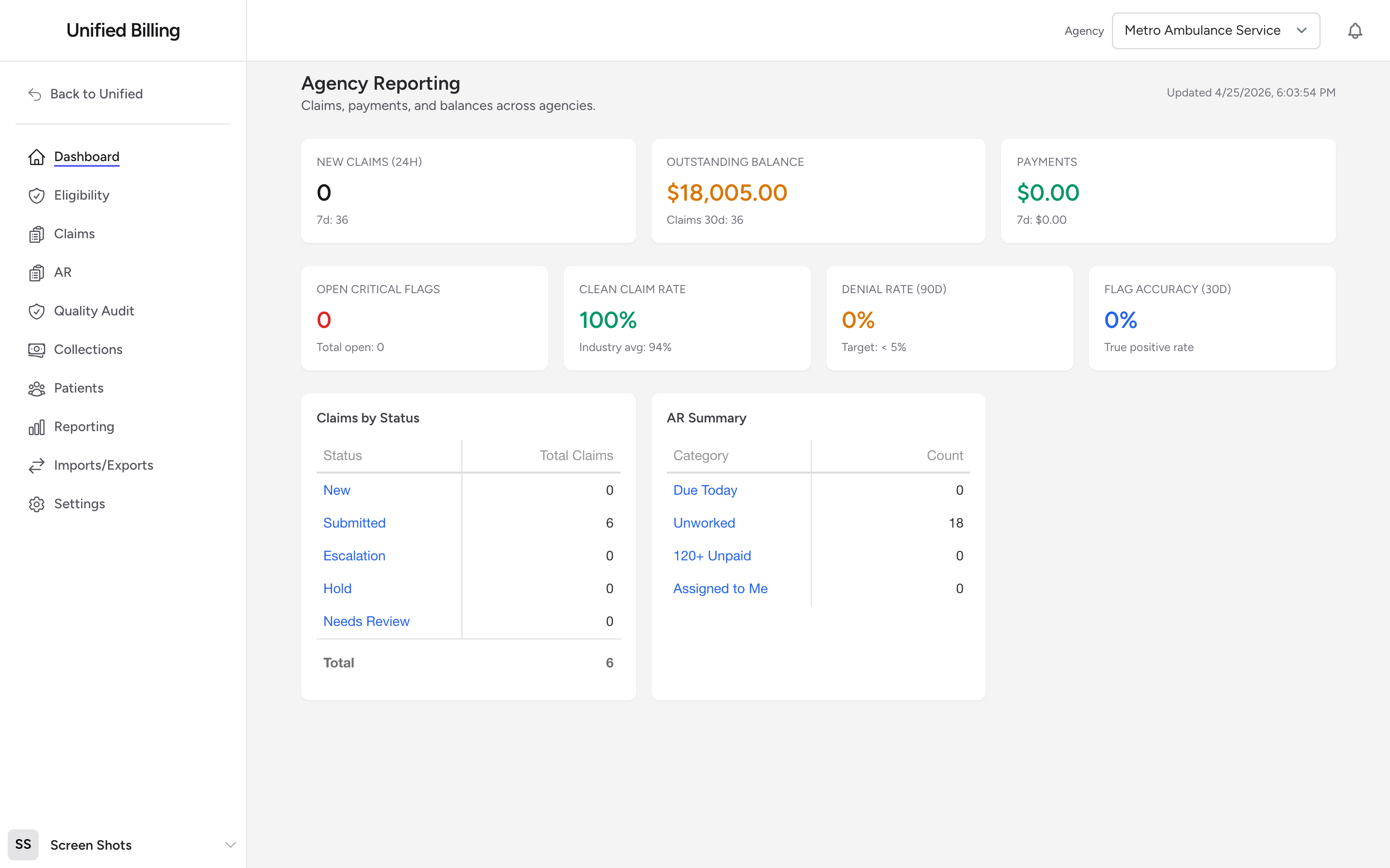
The top stat cards
Three cards sit at the top:
- New Claims (24h) — claims created in the last day, with a smaller 7-day count underneath.
- Outstanding Balance — the total dollar amount still owed across all your claims, with a smaller 30-day claim count underneath.
- Payments — payments posted in the last 30 days, with a smaller 7-day number underneath.
QA metrics
The next row of four cards shows quality-audit metrics:
- Open Critical Flags — critical QA flags that need attention, with the total open count underneath.
- Clean Claim Rate — the percentage of claims that pass QA with no flags. The card shows the industry average (94%) for reference.
- Denial Rate (90d) — the share of claims the payers have denied in the last 90 days. Target: less than 5%.
- Flag Accuracy (30d) — the true-positive rate on QA flags in the last 30 days.
Claims by Status and AR Summary
Below the stat cards, two interactive grids sit side by side:
- Claims by Status — counts of claims in each status. Click any row to jump to the Claims list filtered to that status.
- AR Summary — counts by AR category. Click any row to open the AR page filtered to that category.
Tips
- Check the dashboard at the start of each day. It takes 30 seconds and tells you where to focus.
- If a number looks wrong, click into the related grid for details. The dashboard is a summary — the full picture is in the work queues.