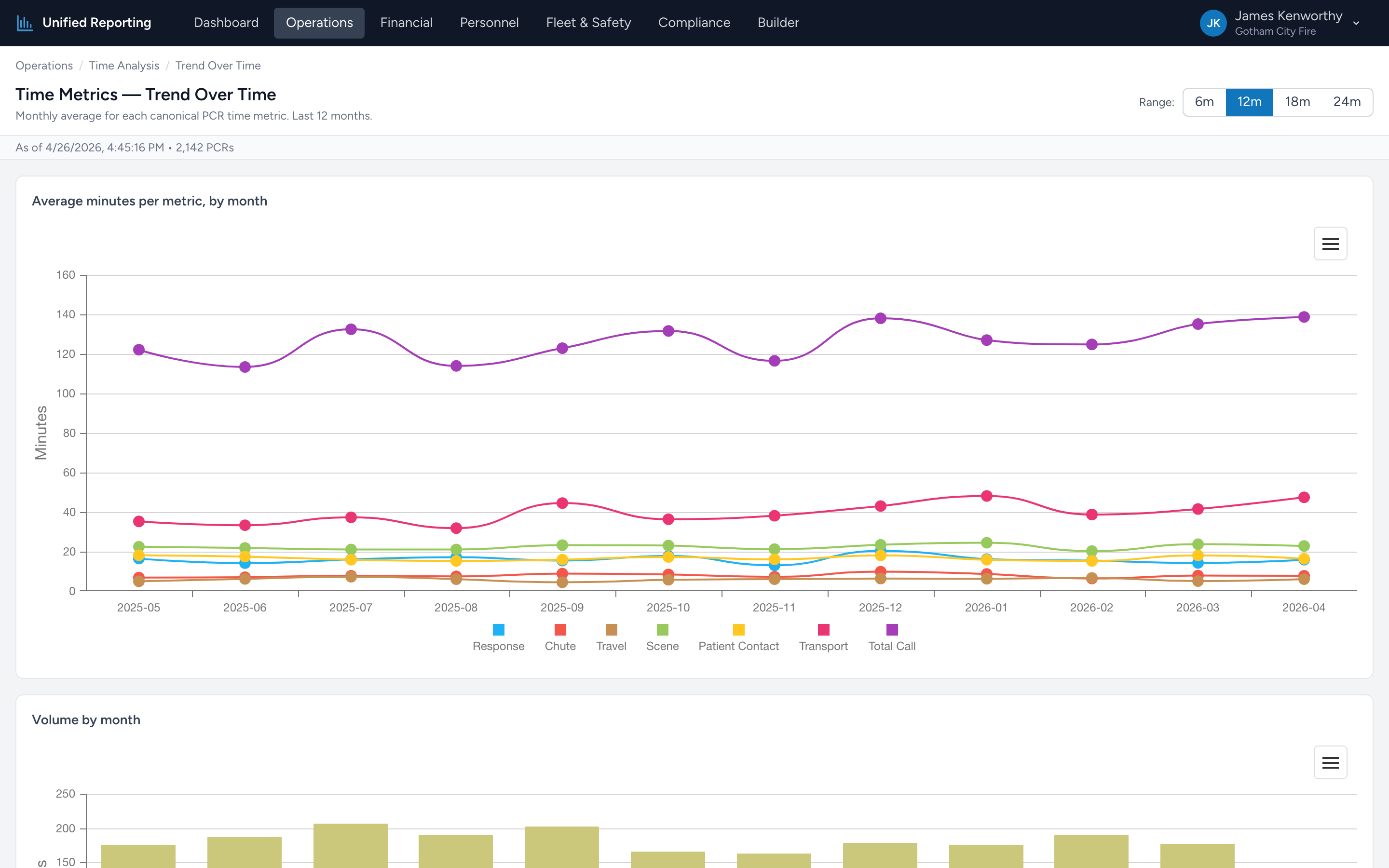
Trend Over Time plots each of the seven timing intervals as its own line, one data point per month. Where the KPI page tells you "your average response is 8.2 minutes," the trend page tells you "your average response was 7.4 minutes a year ago and has been climbing every month since June."
How to use it
- Open Operations → Time Analysis → Trend Over Time.
- Pick a window — 6, 12, or 24 months.
- The chart shows seven lines, one per metric, each in a distinct color. Hover for exact values per month.
- Click a metric in the legend to isolate that line on the chart.
What to look for
- Steady lines — performance is stable. Good baseline.
- Step changes — a sudden up or down jump is usually a process or staffing change. Map the timing back to whatever you changed.
- Slow drift up — averages creeping up month over month. Often a coverage or volume issue. Worth digging into.
- Seasonal shape — many agencies see scene times stretch in winter (snow, bad scenes) and contract in summer.
Pairing with the KPI page
The KPI page is the snapshot. The trend page is the history. Use them together — KPIs to know where you are now, Trend to know how you got there.