Time Analysis is a deep dive into how long things take. Every metric is locked to the seven canonical NEMSIS eTimes — eTimes.03, .05, .06, .07, .09, .11, and .13 — so the numbers are comparable across reports and across agencies on the platform.
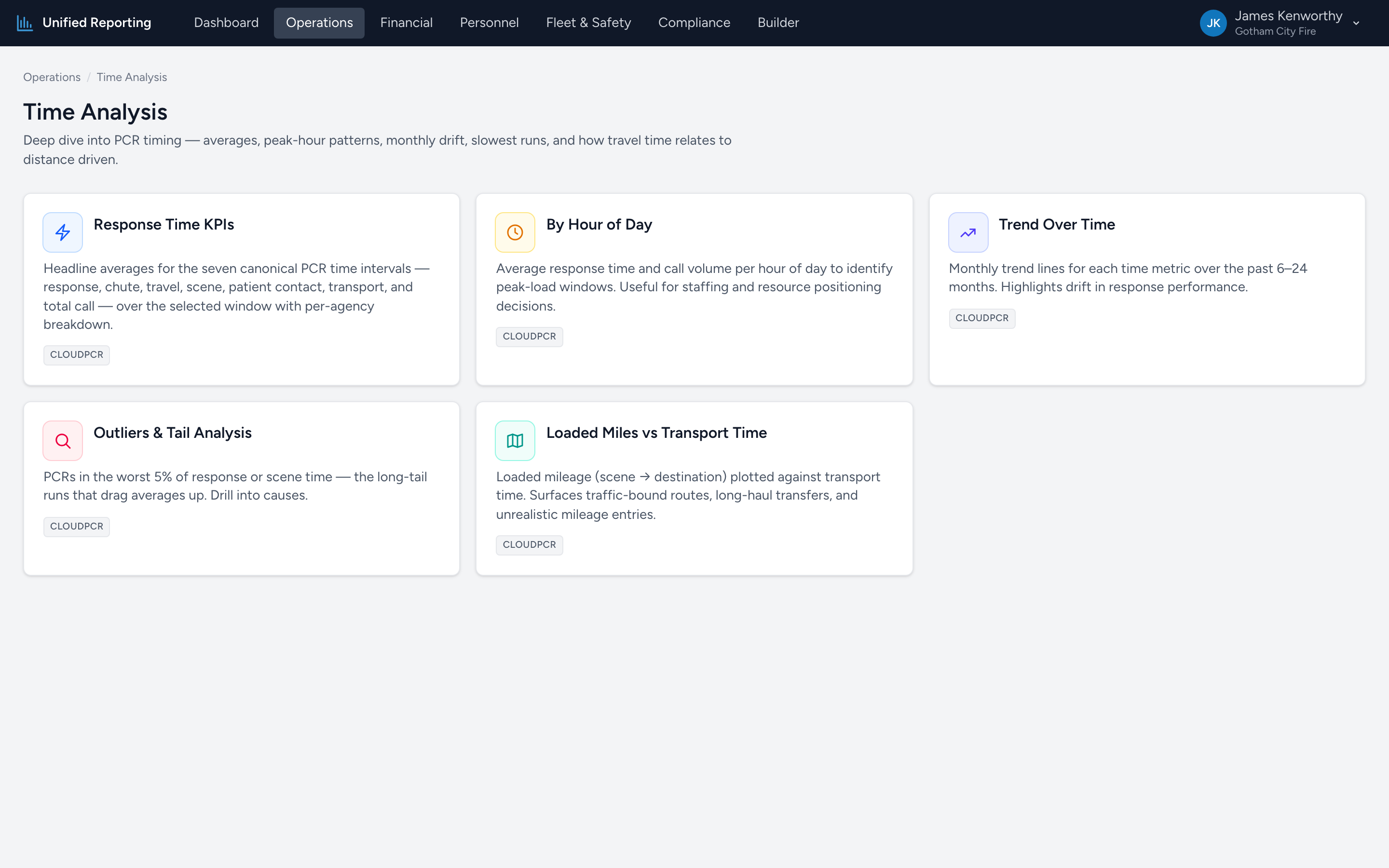
What is in Time Analysis
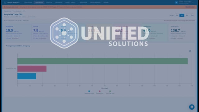
- Response Time KPIs — headline averages for response, chute, travel, scene, patient contact, transport, and total call.
- By Hour of Day — average response time and call volume per hour. Identifies peak-load windows.
- Trend Over Time — monthly trend lines for each timing metric. Highlights drift.
- Outliers & Tail Analysis — PCRs in the worst 5% of response or scene time. The long-tail runs that drag averages up.
- Loaded Miles vs Transport Time — loaded mileage plotted against transport time. Surfaces traffic-bound routes and unrealistic mileage entries.
The seven canonical eTimes
Every Time Analysis report uses these and only these:
- eTimes.03 — Unit Notified by Dispatch
- eTimes.05 — Unit En Route
- eTimes.06 — Unit On Scene
- eTimes.07 — Arrived at Patient
- eTimes.09 — Unit Left Scene
- eTimes.11 — Patient Arrived at Destination
- eTimes.13 — Unit Back in Service
The intervals derived from these are: Response (.03 to .06), Chute (.03 to .05), Travel (.05 to .06), Scene (.06 to .09), Patient Contact (.07 to .11), Transport (.09 to .11), and Total Call (.03 to .13).
Sanity bounds
Each metric has reasonable upper and lower bounds. PCRs with values outside those bounds — typically wrong-day timestamps or data-entry errors — are excluded from averages but counted separately. You will see "1,516 used · 21 excluded" style copy on KPI cards so the data quality is transparent.