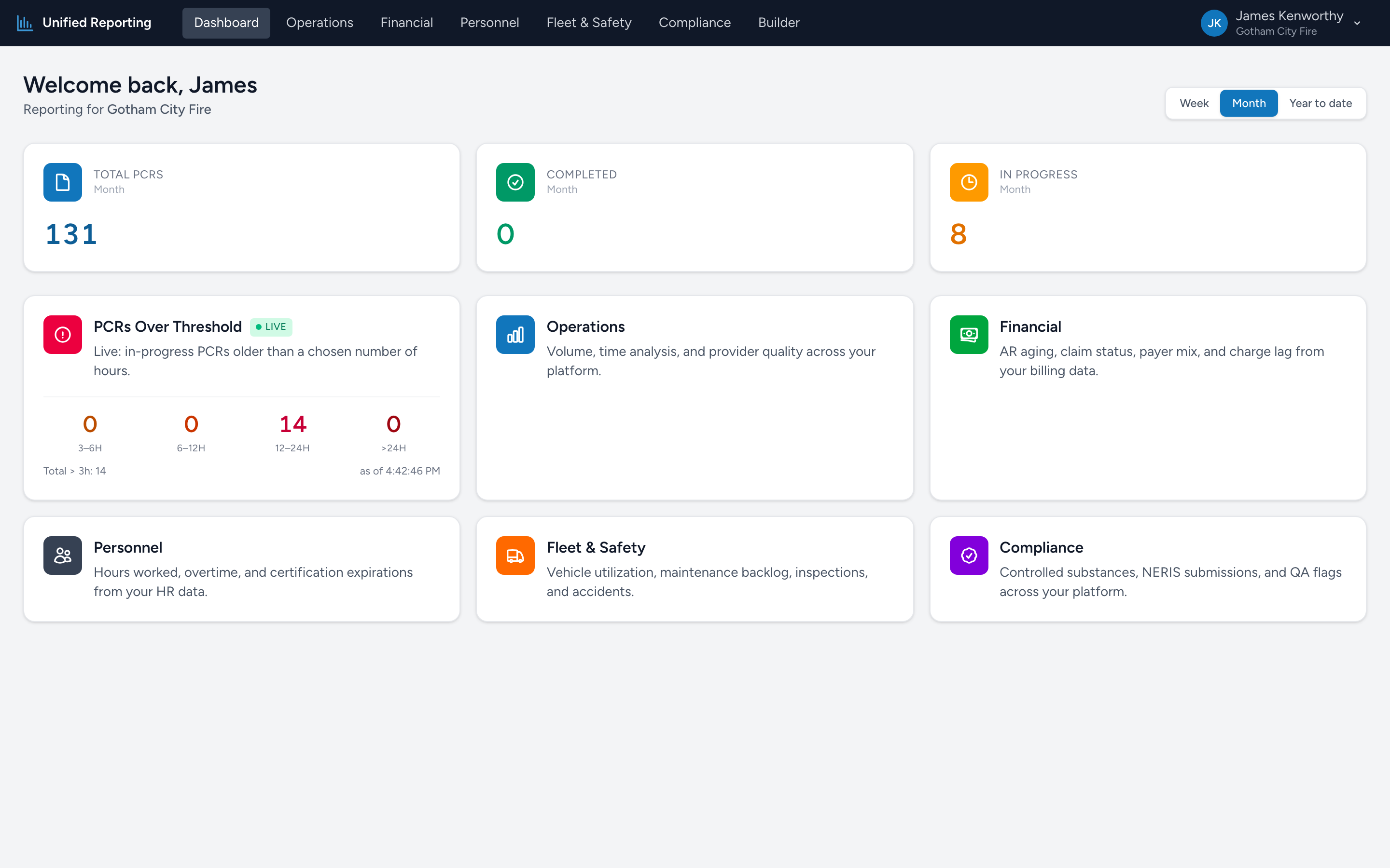
The Analytics dashboard is the first thing you see when you open the app. It is designed to surface the things that need attention right now without making you click into a report.
The period toggle
In the top right of the dashboard you will see three buttons: Week, Month, and Year to date. Pick the window you want the stat cards to summarize. The choice only affects the three stat cards — the category tiles below are always live.
The three stat cards
Across the top, three large numbers summarize PCR activity for the selected period:
- Total PCRs — every PCR with an incident date inside the window, regardless of status.
- Completed — PCRs that have been submitted.
- In Progress — PCRs the crew has started but not yet submitted.
Use these as your "are we on track for the week / month / year" check.
Category tiles
Below the stat cards is a grid of six colored tiles, one for each report category:
- PCRs Over Threshold (Live) — the only tile that shows live numbers right on the dashboard. Underneath the title you will see counts of in-progress PCRs broken out by how long they have been open: 3–6h, 6–12h, 12–24h, and >24h. Click the tile to open the In-Progress PCRs report.
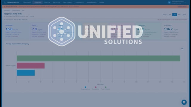
- Operations — call volume, dispositions, response time analysis, clinical case definitions, and AHA Mission Lifeline.
- Financial — claim pipeline, AR, payer mix, payments, and revenue, drawn from your billing data.
- Personnel — certifications about to expire, hours worked and overtime, time-off balances, and employment changes.
- Fleet & Safety — vehicle utilization, maintenance, inspections, accidents, and registration expirations.
- Compliance — controlled substance vault audit, NERIS submissions, QA flags, documentation completeness, and more.
Click any tile to land on that category's report list.
What "PCRs Over Threshold" means
An in-progress PCR is one a crew has started but not yet submitted. There are normal reasons a PCR sits in this state for a while — busy shift, end-of-shift documentation, waiting on hospital information. The four buckets give you a quick read on how stale the open paperwork is:
- 3–6h: normal flow. Crews wrapping up after a long call.
- 6–12h: usually fine. End-of-shift documentation often lands here.
- 12–24h: worth checking on.
- >24h: the bucket to act on. These have stalled.
What the dashboard does NOT show
The dashboard intentionally keeps the surface area small. It is not a place to compare reports side-by-side or to slice data — that is what the report pages and the Builder are for. Think of the dashboard as your "what should I look at first" page.