From the Builder, scroll to Start from scratch and click the Grid / Chart button on the data source you want. You will land in the Workspace with an empty grid and no charts.
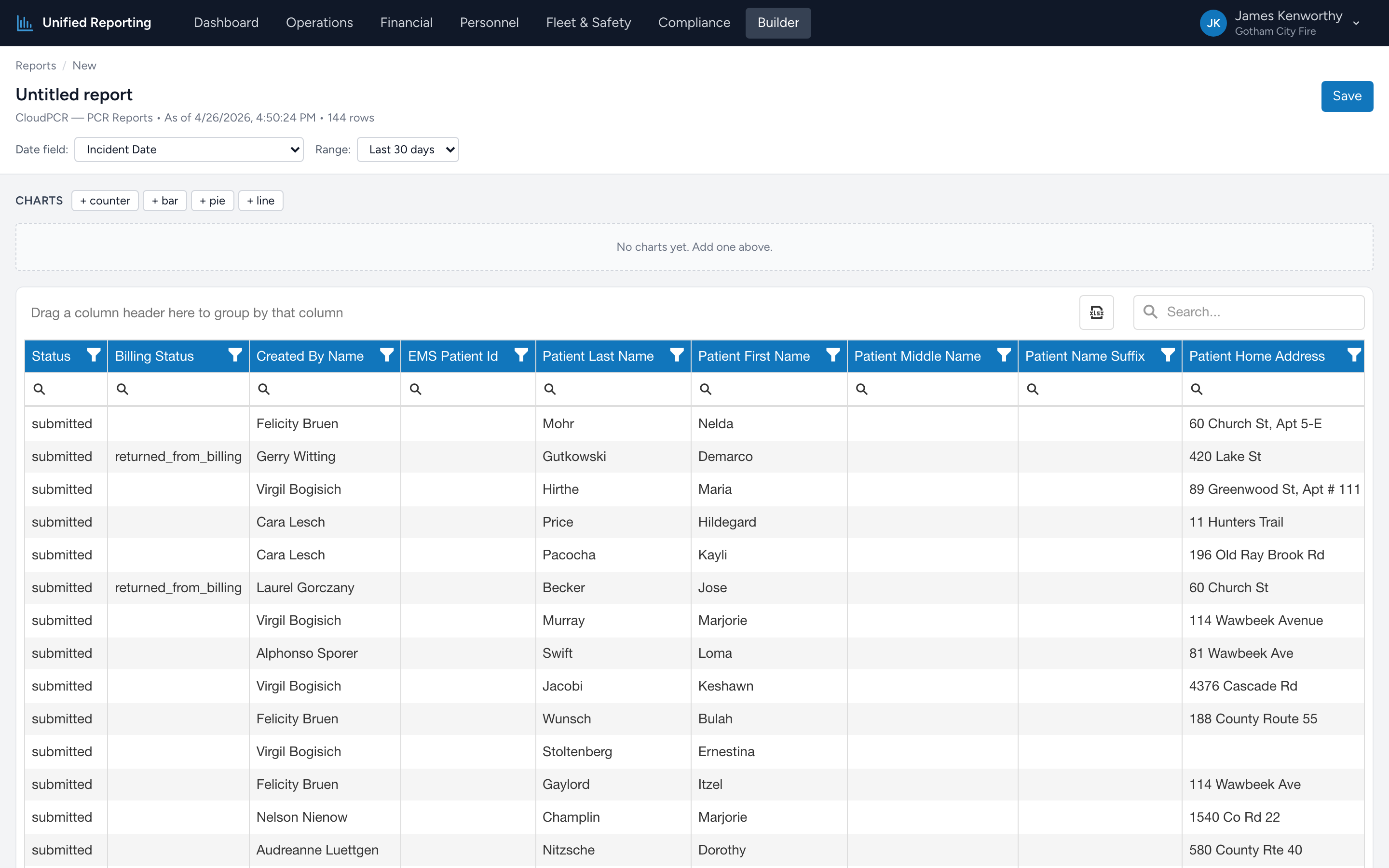
The Workspace layout
- Top: editable report name, breadcrumb, date field selector, range selector, and a Save button.
- Middle: chart panel. Empty until you add charts. Above it sits a row of buttons for adding charts.
- Bottom: a data grid with all available columns from the source's schema, plus a row counter and an "as of" timestamp.
Setting the date range
- Pick the Date field — typically Incident Date.
- Pick a Range — Last 7 days, Last 30 days, Last 90 days, This month, Last month, This year, or Custom (pick start and end dates).
- The grid refreshes immediately. The row counter at the top updates.
The default filter excludes in-progress PCRs (status ≠ in_progress and status ≠ admin_unlocked) so you are looking at finalized data. The "Custom" range goes back as far as you have data; just pick start and end.
Choosing columns
The grid shows every column the source returns. Right-click any column header for sort, group, hide, or pin options. Drag column headers to reorder. The grid state — which columns are visible, in what order, sorted how — is saved when you save the report.
Adding charts
Above the grid you will see four buttons: + counter, + bar, + pie, + line. Click one to add a new chart card. Each chart card has its own configuration:
- Title — click to edit.
- Axis field — only for bar / pie / line. Pick a categorical or datetime column.
- Aggregation — count, sum, avg, min, or max.
- Measure field — only for non-count aggregations. Pick a numeric column.
Charts re-render as soon as you change a setting. Counter shows a single big number. Bar and pie show category × count. Line plots a category (typically datetime) with the measure over time.