
A pivot table lets you cross-tabulate two dimensions of your data with a count or sum in each cell. Where the Builder grid is "rows of data" and the chart panel is "summarized into one shape," a pivot table is "rows by columns by aggregate." Drag fields to the row, column, and data areas; the pivot grid does the rest.
From the Builder landing page
The Pivot section has two parts:
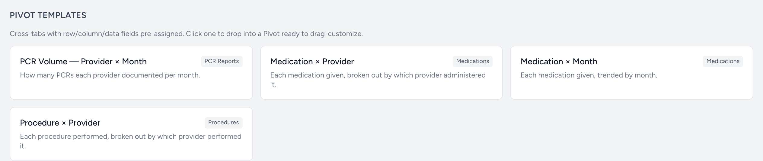
- Pivot Templates — pre-built layouts that load with row/column/data already wired up. Just click and tweak.
- Custom Pivot — three cards (one per data source). Click to open an empty pivot for that source.
The pivot page
Once open, you will see:
- Header — source name, the active template (if any), date field, and date range.
- Field Chooser — sidebar listing every column from the source. Drag fields between Row, Column, Data, and Filter areas.
- Grid — the actual pivot table. Cells update as you change fields.
Picking the right shape
The areas determine what your pivot looks like:
- A field in the Row area becomes a row label.
- A field in the Column area becomes a column label.
- A field in the Data area is what gets counted or summed in each cell.
- A field in the Filter area lets you scope the pivot without showing the field as a row or column.
Most useful pivots have one row, one column, and one data field. Adding more layers up nested groupings.