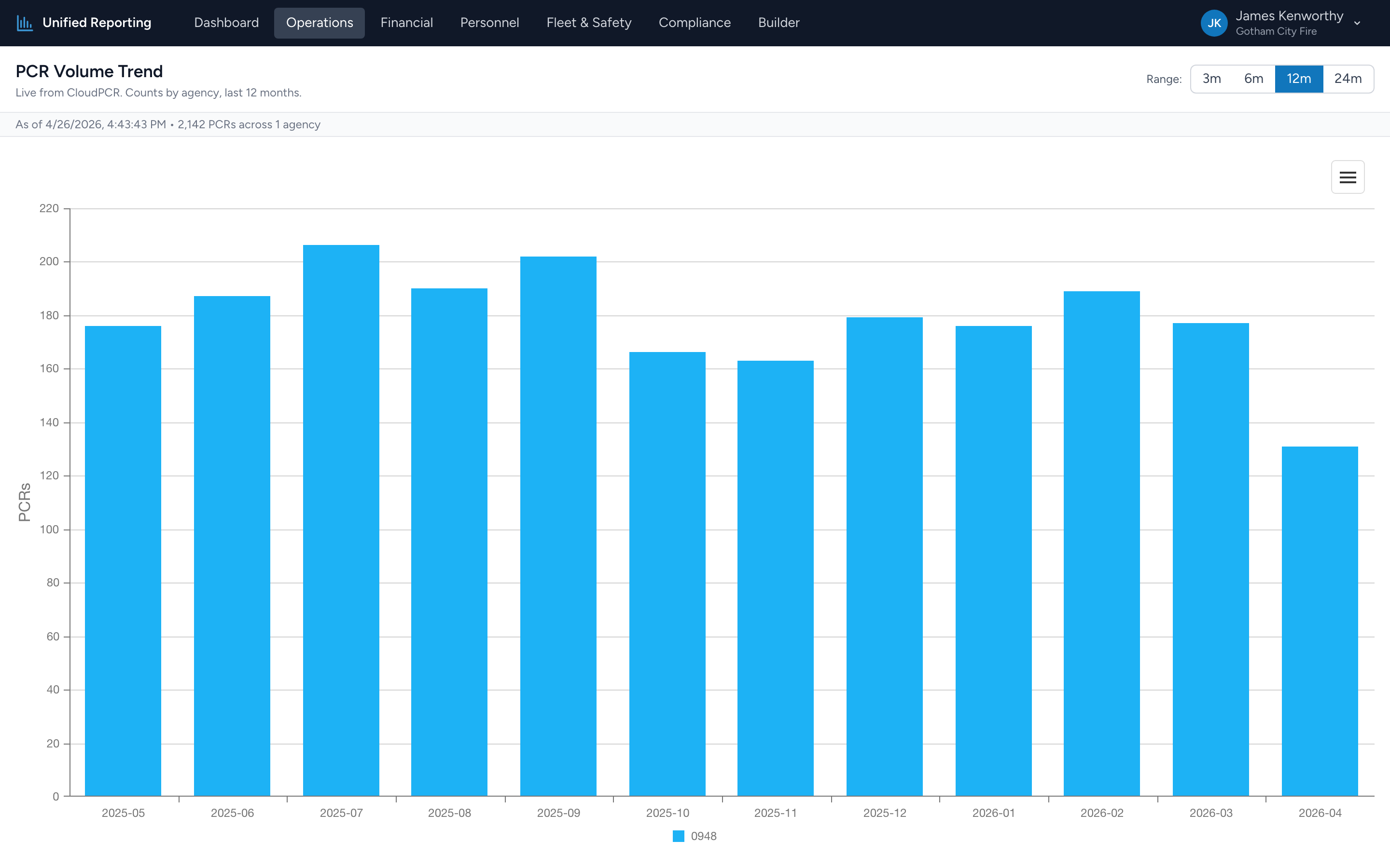
The PCR Volume Trend report shows how many PCRs your agency is documenting per month over a chosen window. It is a good first stop when answering "are we busier than we used to be?" or "did call volume drop after we changed how we do shifts?"
How to use it
- Open Operations → PCR Volume Trend.
- Pick a range: 3 months, 6 months, 12 months, or 24 months.
- The stacked bar chart updates immediately. The x-axis is calendar months; the y-axis is PCR count.
Reading the chart
Each bar is a month. Hover over a bar to see the exact count and the breakdown. Click a segment to drill down to the PCRs that contributed to it.
Look for:
- Trend direction — are bars growing taller over time, flat, or shrinking?
- Seasonality — many EMS agencies see consistent monthly patterns. Summer and holidays often spike.
- Sudden gaps or spikes — a month that is much lower than its neighbors usually means a documentation gap, not a real volume drop. Worth checking.
Counts include all statuses
Volume Trend counts every PCR with an incident date in the window — submitted, approved, in-progress, all of them. The point is to measure activity, not finalized work. If you want to filter to just submitted runs, build that view in the Builder.