
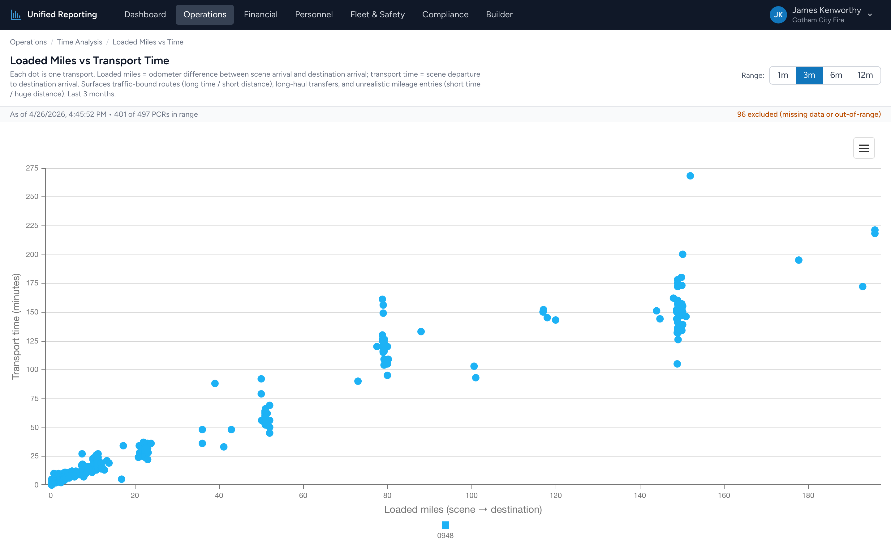
This is a scatter plot — every dot is one PCR. The x-axis is loaded miles (scene to destination); the y-axis is transport time (eTimes.09 to eTimes.11). The pattern tells you a lot about your average drive speed and where it breaks down.
How to use it
- Open Operations → Time Analysis → Loaded Miles vs Transport Time.
- Pick a range. 3 months usually gives a clean picture; 12 months is good for seeing seasonality.
- The chart renders. Each dot is a PCR. Hover for the incident number, miles, and transport time.
What the shape tells you
For most calls there is a roughly linear relationship — more miles equals more time, at a typical drive speed of 30–45 mph in transport. Deviations from the line are interesting:
- Above the line — long transport time for relatively few miles. Traffic-bound routes, urban transports, hospital diversions, or scene departures that got delayed without leaving.
- Below the line — short transport time for high mileage. Highway transfers running at speed, or a documentation issue (mileage entered but transport time mis-stamped).
- Far from the cloud entirely — usually a data entry error. A "150 mile, 4 minute" run is almost always a typo.
Use it for
- Identifying routinely traffic-bound transports — useful for medical control conversations.
- Validating mileage entries — the chart is a quick visual filter for typos.
- Comparing transport speed across different parts of your service area.