
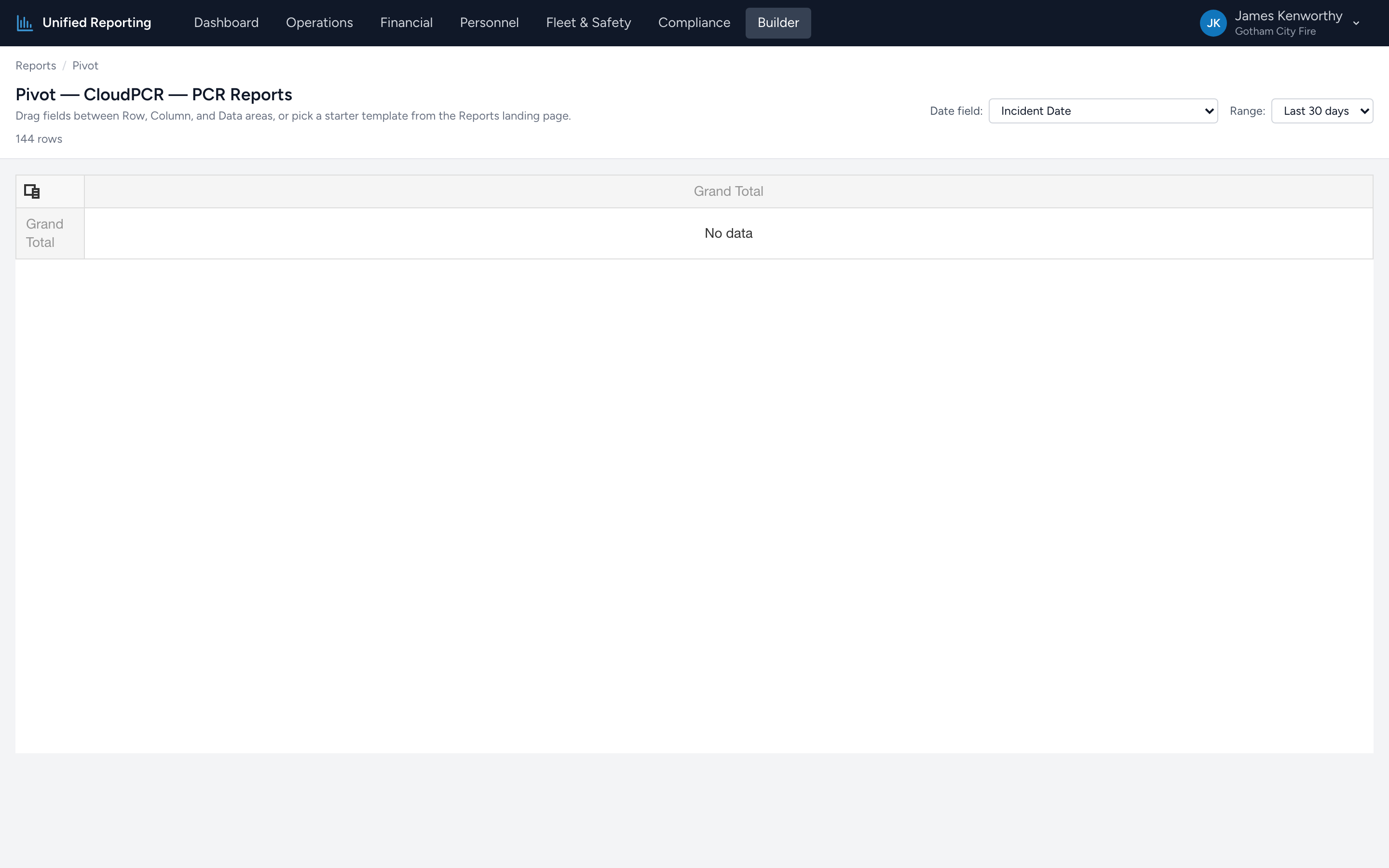
If none of the templates fit your question, build one yourself. From the Builder landing page, scroll to the Custom Pivot section and pick a data source. You will land on the pivot page with no fields assigned.
Step by step
- Pick the Date field at the top (typically Incident Date) and a range.
- Open the Field Chooser if it is not already visible — there is a button at the top of the pivot grid.
- Drag a field from the chooser into the Row Fields area. The pivot adds a row for each unique value of that field.
- Drag another field into the Column Fields area. The pivot adds a column for each unique value.
- Drag a field into the Data Fields area. By default the pivot uses Count as the summary type; right-click the field to switch to Sum, Avg, Min, or Max.
Tips
- Stick to categorical and datetime fields for rows and columns. Numeric fields like response time or patient age are better in the Data area where they get aggregated.
- Drag the same field into Data twice if you want both "count" and "sum" of it side by side.
- Sort by clicking column headers. Use the right-click menu for "Sort by Sum of Field" to sort rows by the data area instead of the row labels.
- Show details — right-click any cell to see the raw rows that contributed to that aggregate. Useful for verifying suspicious numbers.